Hey stats enthusiasts and EV infrastructure geeks! At Electric Era, we’ve built a simulation tool to predict grid capacity needs for our charging stations. Why? Overprovisioning grids leads to expensive, time-consuming installs that end up burdening utilities. Underprovisioning leads to terrible low-power charging, queues and ultimately unhappy drivers. Our tool leans on a data-driven, statistics-based approach to model vehicle arrivals and power draws with real-world fidelity. We’ll zoom into the Seven Feathers site for a case study.
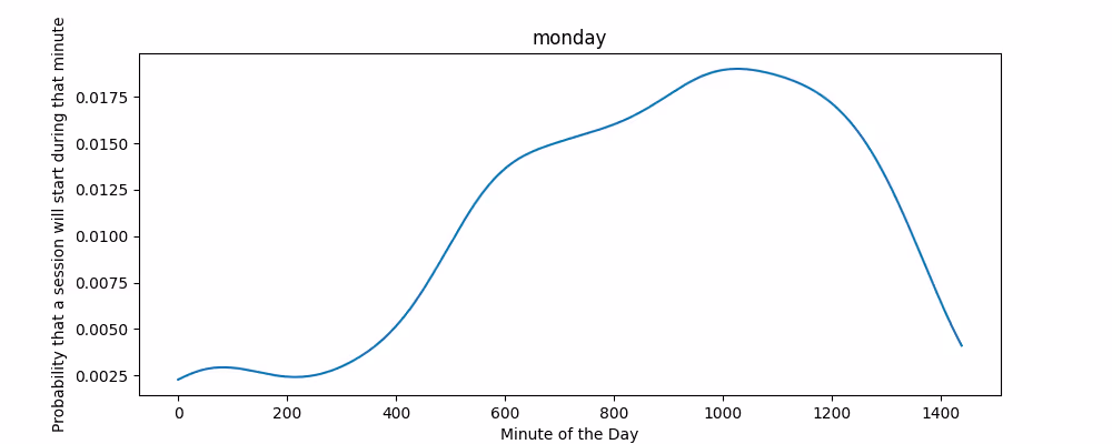
Our tool takes report of historical charging data and generates minute-by-minute arrival probabilities. We use kernel density estimation (KDE) to smooth each weekday’s arrival times into a continuous probability density function. The KDE converts discrete charging sessions into a continuous function that can represents relative demand through a day. Below is a graph generated that represents a Monday.
We chain these daily curves into a month-long probability profile, normalized so each week expects 1 session per day. Normalization creates a flexible baseline. When simulating, we scale the curve by the target sessions per day (SPD) to match expected traffic. For each minute, we multiply its probability by the SPD and run a Bernoulli trial: draw a random number (0–1), and if it’s below the scaled probability, a vehicle spawns. This approach mimics the stochastic nature of arrivals as independent, rare events per minute while preserving the shape of real data.
If we stopped here, daily session counts would follow a Poisson distribution, where variance equals the mean. But real-world EV charging is messier. Weather, holidays, and In-N-Out openings can spike demand. Our data shows a coefficient of variation (CV = std dev / mean) higher than a Poisson’s, meaning more day-to-day fluctuation.
To capture this, we multiply each day’s curve by an overdispersion factor drawn from a gamma distribution with a mean of 1 with a standard deviation proportional to the overdispersion that is observed. This lets us inflate variance without shifting the expected SPD. The overdispersion factor is empirical; it is tuned across datasets to match real-world variance without exaggerating outliers.
Let’s zoom into one of Electric Era’s flagship sites at Seven Feathers, where usage patterns are anything but tame. The month-long probability curve in Figure 2 shows sharp peaks and deep valleys likely driven by seasonal travelers or variable traffic. The KDE captures these fluctuations, highlighting erratic peaks compared to steadier sites.
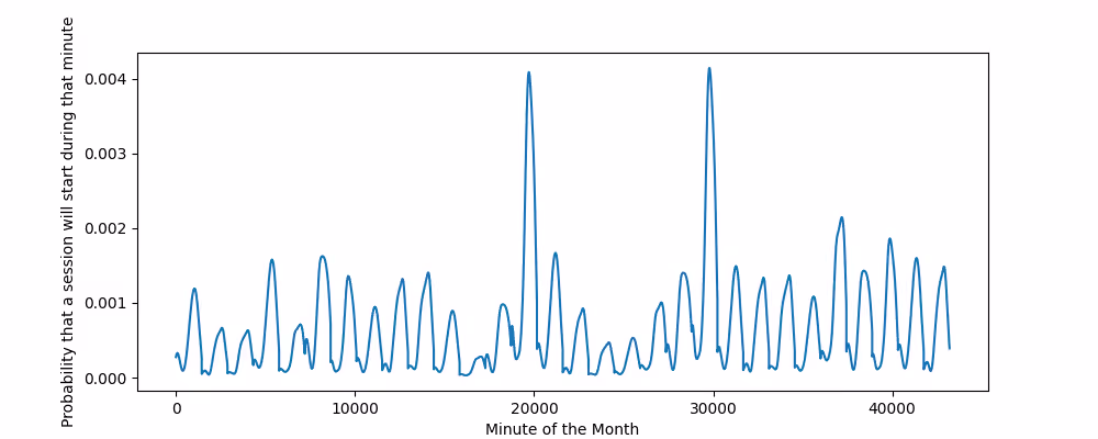
Without overdispersion, a Poisson sim would not have the variance of session counts that we actually see from historical usage data. Our gamma tweak nails the spread, with simulated histograms showing similar variance and tail behavior. The CV matches closely, proving our model handles Seven Feathers’ wild swings.
Above describes how we generate the independent events that represent the arrival of a vehicle at our site. The question then becomes specifics of how each car charges.
How much power does each car pull?
We used a dataset of the most popular EVs in the United States. We then looked up using publicly available data the charging curve that maps SOC (state of charge) of the vehicle to the maximum charging power for each of these vehicles.
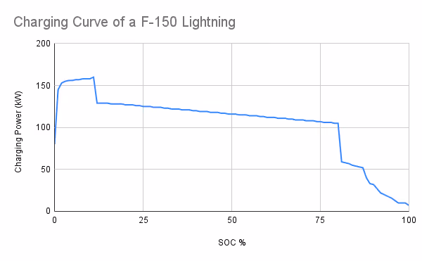
This charging curve is pretty typical of the curves that we see in our fleet. When the battery is very low, the battery is able to accept lots of power. The curve then flattens out, slightly decreasing as the SOC increases. There is then a steep drop-off as the vehicle reaches 80% SOC. Usually at this point the charging drops into what is called constant-voltage mode where the voltage is no longer contiguously changed to target a particular power and instead the voltage provided by the charger is held consistent and the power decreases as the voltage of the battery cells increases to approximate the charging voltage.
How long do drivers charge for?
EV drivers almost never charge from 0% to 100% SOC like we see in the curve above. So how do we model the starting SOC and amount of energy delivered to each vehicle we simulate?
We again turn to our historical dataset of 36,000 charging sessions and counting. We sample from our actual public charging distributions to select what SOC the vehicle starts at and ends at.
Since we sampled from the most popular vehicle models in the United States, the battery sizes of our modeled vehicles is similar to the battery sizes that we observe in our historical data. Since we sample the change in SOC from our dataset we land on an average energy delivered per-session, 33 kWh, that is approximately equal to the average session observed across all of our sessions.
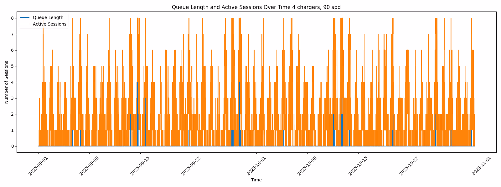
If all ports (e.g., 8 for 4 dual-port chargers) are occupied, vehicles join a FIFO queue, waiting for a free port. Queue lengths spike during overdispersed peaks, informing grid/battery sizing to reduce waits. See Figure 4 for an example of a saturated 4-charger station.
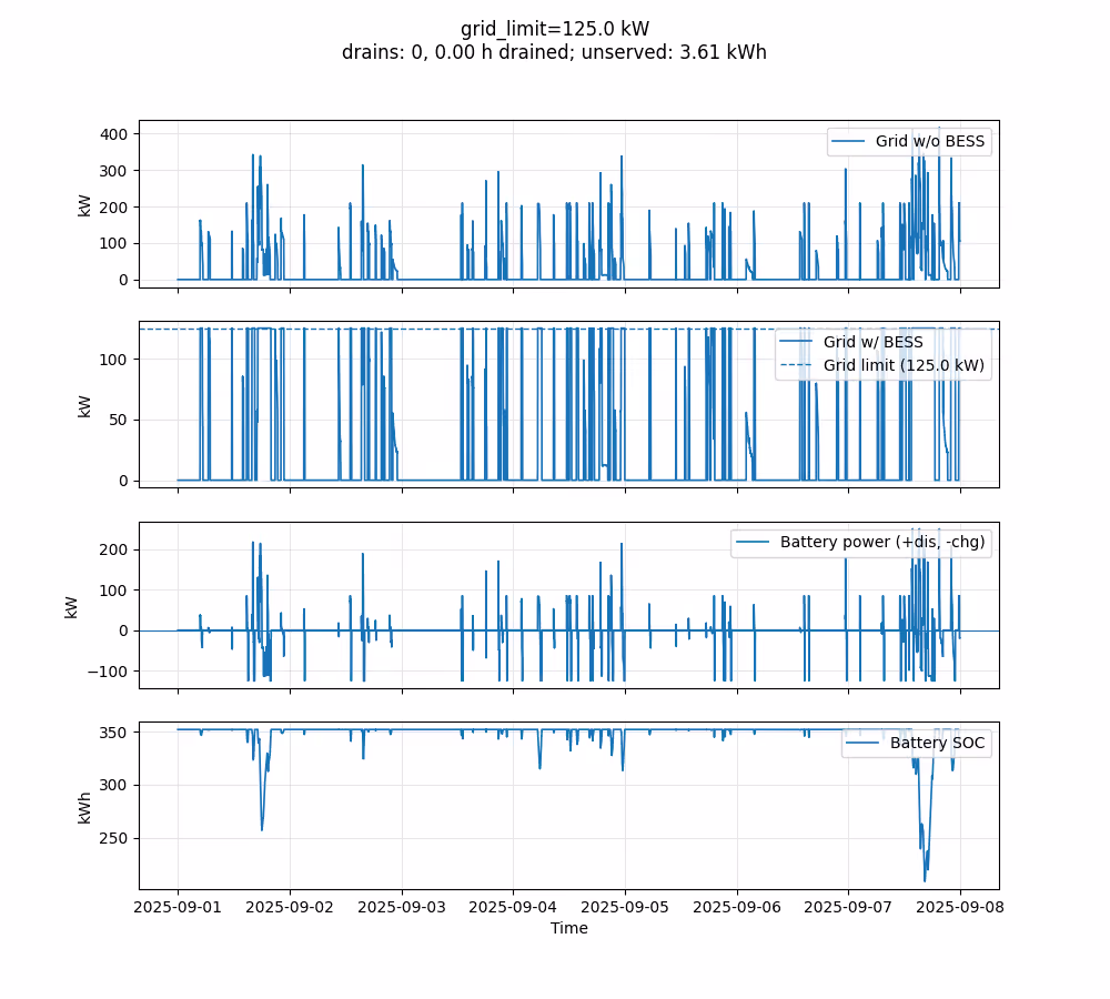
Demand from sessions (with dual-port chargers capped at 100kW/port) is balanced against BESS (93% efficiency) and chargers (95% AC-DC). Grid limits are set explicitly (e.g., 125kW) or via CDF percentiles (e.g., 99% unimpacted time, minus battery discharge). If batteries deplete, we optionally re-run with higher limits. Visuals in Figure 5 show the guts of the sim, capturing demand, battery, and grid interplay. This guides the tool’s search for the optimal configuration.
For deeper dives or economic analysis of different power tariff structures, the simulation will calculate the power bills for the site each month. As an example, if we have an optional TOU tariff we could choose, it is helpful to be able to easily turn power traces into dollar values.
We can also change configurations of the the simulated BESS system. For example, we model preempting recharging while TOU charges are in effect and use the sim tool to see how this change of configuration will affect drivers.
Outputs from the tool include CDFs, power traces, and queue/charging time-series. One such example CDF is provided in Figure 6, which shows the power demand necessary to meet instantaneous power request at any given point in time.
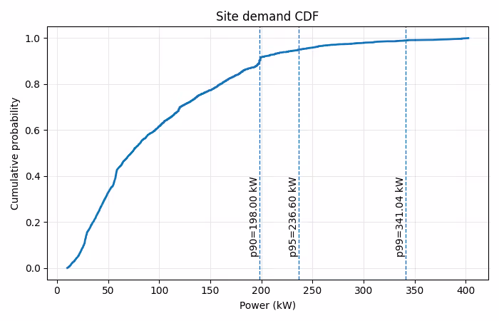
Note the long tail between p95 and p99! This is one core reason not to design for nameplate capacity at any site. Avoiding 100+kW of installed power and runtime power draw improves site economics dramatically while having negligible impact to charging itself, ultimately making EV fast charging more accessible for drivers.
At the macro loop, the sim produces a spreadsheet for site analysis that allows filtering by ports, batteries, SPD, and see the appropriate grid limits.
What do you think about our approach? At Electric Era, we’re taking a data-backed approach to everything we do. Stay charged!
Interested in working on problems like this? Check out our careers page--we have positions in software, including for engineers specializing in embedded software.